 Chart-Output
- 1 Pick a chart
- 2 Make it yours

Alt text for this chart
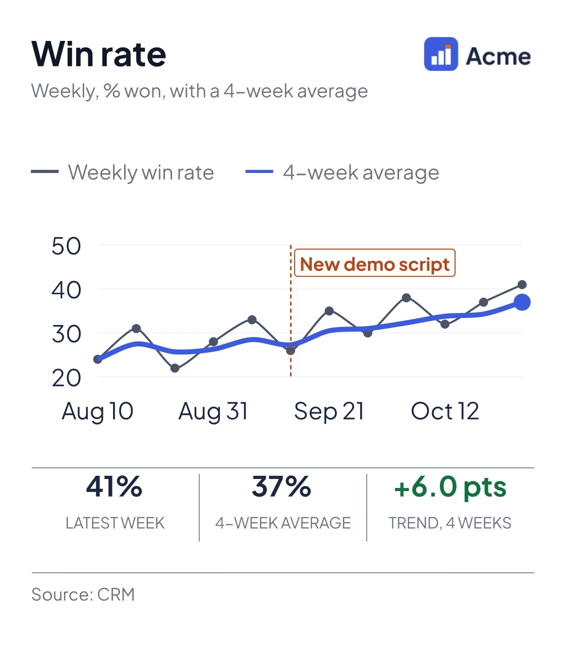
Line chart of weekly win rate over 12 weeks from Aug 10 to Oct 26. The weekly rate is noisy, between 22% and 41%; a heavier line shows the four-week average climbing from 24% to 37%. A marker at Sep 14 shows when the new demo script started.Line with moving average chart · One API request
Win rate with a rolling average
Weekly win rate with a four-week average on top, so the trend shows through the week-to-week noise. Change the numbers and the request below follows. Send it from Make, n8n, Zapier or a script, and the image comes back.
Columns: Week, Win rate. Paste rows from a sheet, or type one per line. Win rate as a percentage, like 31.
2. The request that makes it
{
  "type": "line",
  "width": 560,
  "height": 640,
  "textScale": 1.8,
  "format": "png",
  "devicePixelRatio": 2,
  "legend": {
    "display": true,
    "position": "top",
    "style": "line",
    "fontSize": 13
  },
  "data": {
    "labels": ["Aug 10", "Aug 17", "Aug 24", "Aug 31", "Sep 7", "Sep 14", "Sep 21", "Sep 28", "Oct 5", "Oct 12", "Oct 19", "Oct 26"],
    "datasets": [
      {
        "label": "Weekly win rate",
        "data": [24, 31, 22, 28, 33, 26, 35, 30, 38, 32, 37, 41],
        "order": 1,
        "borderColor": "#4a5368",
        "backgroundColor": "#4a5368",
        "borderWidth": 2,
        "tension": 0.2,
        "pointRadius": 3.5,
        "pointBackgroundColor": "#4a5368"
      },
      {
        "label": "4-week average",
        "data": [24, 27.5, 25.7, 26.3, 28.5, 27.3, 30.5, 31, 32.3, 33.8, 34.3, 37],
        "order": 0,
        "borderColor": "#3c5cdd",
        "backgroundColor": "#3c5cdd",
        "borderWidth": 5,
        "borderDash": [],
        "tension": 0.3,
        "pointRadius": [0, 0, 0, 0, 0, 0, 0, 0, 0, 0, 0, 6],
        "pointBackgroundColor": "#3c5cdd"
      }
    ]
  },
  "annotations": [
    {
      "x": "Sep 14",
      "label": "New demo script",
      "color": "#b4461a"
    }
  ],
  "options": {
    "plugins": {
      "tooltip": {
        "enabled": false
      }
    },
    "scales": {
      "x": {
        "grid": {
          "display": false
        },
        "border": {
          "color": "#e3e7ef"
        },
        "ticks": {
          "color": "#4a5368",
          "maxRotation": 0,
          "autoSkip": true,
          "maxTicksLimit": 5
        }
      },
      "y": {
        "beginAtZero": false,
        "grace": "8%",
        "border": {
          "display": false
        },
        "grid": {
          "color": "#e3e7ef",
          "drawTicks": false
        },
        "ticks": {
          "color": "#4a5368",
          "padding": 8,
          "maxTicksLimit": 5
        }
      }
    }
  },
  "kpiStrip": [
    {
      "label": "Latest week",
      "value": "41%",
      "color": "#1d2640"
    },
    {
      "label": "4-week average",
      "value": "37%",
      "color": "#1d2640"
    },
    {
      "label": "Trend, 4 weeks",
      "value": "+6.0 pts",
      "color": "#13703f"
    }
  ],
  "footer": {
    "left": "Source: CRM",
    "borderTop": true
  },
  "header": {
    "title": "Win rate",
    "subtitle": "Weekly, % won, with a 4-week average",
    "logoUrl": "https://www.chart-output.com/gallery/acme-logo.png",
    "logoHeight": 22
  },
  "theme": {
    "backgroundColor": "#ffffff",
    "textPrimary": "#1d2640",
    "textSecondary": "#4a5368",
    "gridColor": "#e3e7ef",
    "mode": "light"
  }
}
It carries this chart's colours in theme, so it runs on any account. To use your own logo and colours, swap theme for "brand": "your-kit-slug" (brand kits).
1,000 renders a month free. No card.
About this chart
- When to pick it
- Use it when the week-to-week numbers are noisy and the trend is what you want people to see.
- The data it takes
- Columns: Week, Win rate. 2 to 26 rows. Win rate as a percentage, like 31.
- What it shows off
- Line with moving average, under Sales. Brand kit, Computed second series, Event annotation, KPI strip.
- For scripts and agents
- This chart's request (JSON) · This page as Markdown · Every chart (JSON)
Questions
about this chart.
How do I make this win rate with a rolling average chart with my own data?
Paste your numbers into the box on this page and the chart and its request update. To make it from your own workflow, send that request to POST https://www.chart-output.com/api/v1/render with a free API key; the response is the image.
What data does it take?
Columns: Week, Win rate. 2 to 26 rows. Win rate as a percentage, like 31.
Can ChatGPT or Claude make this chart?
Yes. Add https://www.chart-output.com/mcp as a custom connector and ask for the chart; its render_chart tool takes this page's request and returns the image, with no API key. Or use "Copy prompt for your AI" on this page.
What does it cost?
The free plan includes 1,000 renders a month, with no card. Paid plans add more renders and remove the watermark.
What do I get back?
A finished image: PNG by default, or SVG, WebP or JPEG, and PDF on Pro. Set "format" in the request.
Or start from another chart
Pipeline by stageOpen pipeline value by sales stage, with the value printed on every bar for the weekly sales call.BarQuota attainment by repEvery rep ranked by attainment, with a line at quota and the reps below it in a second colour.Ranked horizontal barLTV vs CAC by channelWhat a customer is worth beside what they cost to win, for each channel, with the ratio in the strip.Grouped horizontal barQuarter to goalOne number against its goal: a half-doughnut gauge with the attainment on the arc and the amounts in the strip.GaugeSupport tickets by priorityA year of support tickets stacked by priority: the total load climbing while the high-priority band shrinks.Stacked areaPut it in a workflow
Charts for Slack, Discord and Teams botsPost daily metrics, alerts and reports as real chart images from a bot.GuideAdd a chart to a Zapier Zap or Make scenarioTurn a spreadsheet row into a chart image URL and send it to Slack or email.GuideChart.js PDF reportsBuild automated PDF reports with chart visuals, without launching a headless browser.GuideAdd this chart to
your next report.
Send the request from the workflow that builds the report. 1,000 free renders a month, no card.
Get a free API keyEvery plan resets monthly. No automatic overage charges.